


Understanding Sprint Burndown Chart in Scrum Project Management

Project management does not imply approximations or inaccuracy. Therefore, there are so many numbers, schemes and precise charts in methodologies, tools, and services’ functionality.
A Burndown Chart is one of the most effective tools for monitoring project progress and tracking team performance in Scrum. In this post, I’d like to briefly describe what a Sprint Burndown Chart is and how it helps to track task completion and work remaining within each sprint.
What is the Burndown Chart?
A Burndown Chart is a visual tool that is typically used during Stand-up meetings to assess how much work has been completed. Project managers use it also as a forecasting tool. The chart demonstrates a rough idea of how teams are doing in the current Sprint.
Burndown Charts can be easily understood by all team members, that’s why this visually appealing format is often used by many Agile practitioners.
The chart helps to measure how much work has been completed on a specific project during a specific timeframe (compared to the time still available to complete the project). It shows the amount of work planned vs what is performed during every iteration.
Here is an example of a Burndown Chart
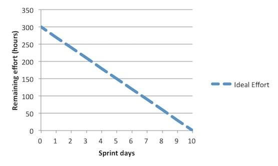
*the image from Study com
Here we can calculate the total effort the team will produce during a sprint. It is recommended to estimate the daily effort of each team member as six hours when doing the planning.
If imagine 5 team members who are working 6 hours every day for 10 days, so the total effort of the sprint is 5x6x10. It is 300 hours. The estimated effort of all tasks in the task breakdown for the sprint should add up to 300 hours.
The ideal effort that assumes all tasks will be completed by the end of the sprint is visualized with the blue dotted line here.
With the start of the sprint, every developer will pick a task and work on it during the first day. Then, at the end of the day, everyone will have to update the task breakdown.
Advantages and disadvantages of Burndown Charts
As every effective tool, a Burndown chart has its own strength and weaknesses, pros and cons, its advantages and disadvantages. Starting with the positive things:
Advantages of using a Burndown Chart are:
- The chart is a simple and easy-to-follow visualization
- It clearly reflects an Agile team’s achievements and shows what the team needs to achieve
- The chart lets the team know if it is on target with set deadlines
- It quickly alerts teams about potential bottleneck situations and problems
- It demonstrates teams where they can focus their efforts to get back on track
- It shows teams where they have succeeded
- Finally, it motivates the team
Disadvantages of using a Burndown Chart include:
- The chart only shows the part of the total picture – it means that it is limiting
- It does not show what tasks are still in progress
- It does not reflect how close the team is to complete the work
- It can lead to exaggerated expectations
Teams that have unrealistic or over-inflated timeframes can easily lose their motivation or become disgruntled when the project does not run smoothly.
How to create a Burndown Chart?
Before creating a Burndown Chart, the team should first implement a task breakdown. It usually happens during the sprint planning meeting. Every task in the breakdown should include a specific amount of time to complete the task.
After tasks breakdown, the team can create and use a Burndown Chart. The team can assume that every task will be completed at the same rate as the rest of the tasks, so their ideas should reflect the steady progress.
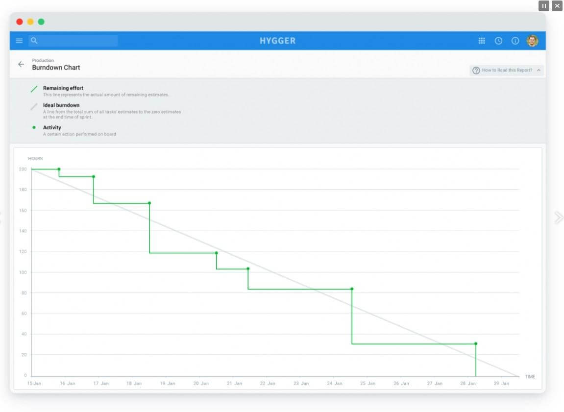
You may simply create an excel spreadsheet with X and Y axes to visualize a Burndown Chart. However, there are special available Agile tools and services with built-in Burndown Chart abilities. Hygger.io is one of them.
To sum up
Teams use the Burndown Chart to get the information they need to self-organize, self-manage and self-direct themselves to greater success. This tool may be helpful on a daily basis.
The Sprint Burndown replies on the team being as honest, transparent and accurate as they can be about all the work remaining. Do not hesitate to use it in a smart way and adjust to your project and your needs.
What is your experience with Burndown Charts?
If you still have some ambiguities and gaps regarding Sprint Burndown Charts, then you can watch a short video on this topic that may provide more details:


